
Stop trying to replicate cell-by-cell design in Power BI.
If you are working in Power BI, start thinking on a column-level.
For this post, you can download pbix file and data used for this demo example:
Download pbix file here: https://drive.google.com/file/d/1j-KExcFxQAL76ys8h4lGk9WFDbVbz16-/view?usp=sharing
Download Excel file (data): https://docs.google.com/spreadsheets/d/1fpTcYO-4BoI0_PXa3JNVf3iMcQdrsXFn/edit?usp=sharing&ouid=117799558211098864725&rtpof=true&sd=true
The challenge
I was asked to build a single Power BI page that looked like a normal paginated/Excel report.
The page contained 6 table visuals. Each table displayed 3 columns (plus 1–2 header rows), but each cell’s value had its own logic – different measures, different formatting.
One table alone had ~30 unique elements.
Multiply that by 6 tables (and throw in hidden slicers/filters and helper objects) and you get 250+ objects on the page.
In image below:
L – represent which label should be displayed
V – represents which metric should be displayed
So requirement was not just drag and drop column to the visual.

The first idea that comes to my mind.. 30 cells from image above = 30 card visuals in Power BI?
A junior developer would accept the task and try to drag-and-drop 250 objects (mainly card visuals) onto the page. A senior developer stops and asks: how should this be built so it works with Power BI, not against it?
Tools like SSRS or Excel are cell-based. When you force a cell-based approach in Power BI you quickly get:
- explosive number of visuals/objects on a page, hurting performance and maintainability
- complex reports that are hard to change
Data structure
For this demo, i will use Excel file as a source.
It contains sheet “Demo data”.
There, we can see a lot of columns:
Dimension columns: promotion name, category, status..
Measure columns: measure 1, measure 2, measure 3…

The goal is to create a visual which will have 3 columns.
In the first column: show name of the metric.
In the second column: show value of metric with specific filters.
In the third column: show value of metric with specific filters.
Example:
In the first column, we will have name of measures: measure 1, measure 2, measure 3..
In the second column, we will have value of each of these KPIs, including filters.
For row 1: calculate sum(measure 1), where category = “Laptop”, Status = “Completed”, Language = “English”, Subcategory = “Total”, Type = “A”.
For row 2: calculate sum(measure 2), where category = “Laptop”, Status = “Completed”, Language <> “English”, Subcategory <> “Total”, Type = “A”.
This column shows only rows where Type = “A”. The other filters are dependent on row / measure.
In the third column, the logic is the same as for second column, the only difference is that mandatory filter for all values in this column is Type = “B”.
So, calculation logic is the same for 2nd and 3rd column, the only difference is filter.
However, this “small” change means we will not be able to set visual level filter, it needs to be done in DAX.
Desired simple output:

Step-by-step — how I actually did it
Step 1 – show KPI name in row headers (i used Power Query)
There are a few ways how to solve it.
By default, metrics (numeric columns and measures) are aggregated on the visual.
Now, we need to show them in rows and also in values.
There is a way to format matrix visual, to show KPI name in the first column (matrix > values > options > switch values to rows), but this will not solve my issue.
My FIRST GOAL is to transform 10 metric columns into 2 columns.
The first column will show KPI name.
The second column will show KPI value.
In other words, from this data structure:

To this data structure:

Power Query steps:
Select all non-measure columns, go to transform ribbon, unpivot columns and choose Unpivot other columns.
It will take all numeric columns (measures) into 2 columns, one is attribute (measure name), another is value (measure value).

Pay attention: if you have a table which contains millions of rows, be aware that this will multiply the number of rows based on number of metrics you have. If this should be used on only one specific page, just keep fact table as is, and for that specific new report page, create a new table (query),which will automatically filter data and keep only columns that you need.
Step 2 — Calculations (DAX)
Now, when we have measure name in rows, we can easily manipulate Dax calculations.
Let’s build our first calculation check based on business requirement.
Reminder: For row 1: calculate sum(measure 1), where category = “Laptop”, Status = “Completed”, Language = “English”, Subcategory = “Total”, Type = “A”.
Here is DAX calculation for the 1st row:
1st measure = CALCULATE( SUM('Demo data'[Measure Value]) , 'Demo data'[Measure Name] = "measure 1" , 'Demo data'[Category] = "Laptop" , 'Demo data'[Status] = "Completed" , 'Demo data'[Language] = "English" , 'Demo data'[Subcategory] = "Total" , 'Demo data'[Type] = "A")
Here is DAX calculation for the 2nd row:
2nd measure = CALCULATE( SUM('Demo data'[Measure Value]) , 'Demo data'[Measure Name] = "measure 2" , 'Demo data'[Category] = "Laptop" , 'Demo data'[Status] = "Completed" , 'Demo data'[Language] = "English" , 'Demo data'[Subcategory] <> "Total" , 'Demo data'[Type] = "A")
Final step is to create one metric which handles all these metrics.
So, instead of 10 measures, you actually have only ONE dynamic measure.
And, in order to make it work, we will use SWITCH statement, which checks current row in table.
If we add a column “Measure Name” in table visual, we can use function SELECTEDVALUE, which returns exactly on which row in table we are.
Watch now:
Dynamic Measure 1 = // check current measure (current row in table visual)var _selected_kpi = SELECTEDVALUE('Demo data'[Measure Name])RETURN // for current measure name, return relevant measure valueCALCULATE( SWITCH( TRUE()// in row for "measure 1", show calculation for "measure 1" ,_selected_kpi = "measure 1" , CALCULATE( SUM('Demo data'[Measure Value]) , 'Demo data'[Measure Name] = "measure 1" , 'Demo data'[Category] = "Laptop" , 'Demo data'[Status] = "Completed" , 'Demo data'[Language] = "English" , 'Demo data'[Subcategory] = "Total" , 'Demo data'[Type] = "A" )// in row for "measure 2", show calculation for "measure 2" ,_selected_kpi = "measure 2" , CALCULATE( SUM('Demo data'[Measure Value]) , 'Demo data'[Measure Name] = "measure 2" , 'Demo data'[Category] = "Laptop" , 'Demo data'[Status] = "Completed" , 'Demo data'[Language] = "English" , 'Demo data'[Subcategory] <> "Total" , 'Demo data'[Type] = "A" ) )/*// if all measures are using some common filters, you can move these filters here// in my case, i can move Category, Status and Language filters here, to remove duplication of rows ,FILTER( 'Demo data' , 'Demo data'[Category] = "Laptop" , 'Demo data'[Status] = "Completed" , 'Demo data'[Language] = "English" )*/)
This approach gives us opportunity to combine in same “column”, values with different formats (whole number, decimal, percentages..).
How?
Here are examples:
FORMAT(CALCULATE(SUM('Demo data'[Value]), "#,##0") // no decimal 12,345FORMAT(CALCULATE(SUM('Demo data'[Value]), "#,##0.0") // one decimal 12,345.67FORMAT(CALCULATE(SUM('Demo data'[Value]), "0.0%") // percent 12.3%FORMAT(CALCULATE(SUM('Demo data'[Value]), "#,##0;(#,##0)") // parentheses (1,234)FORMAT(CALCULATE(SUM('Demo data'[Value]), "#,##0,K") // thousands 12KFORMAT(CALCULATE(SUM('Demo data'[Value]), "#,##0.0,,M") // millions 12.3M
Fill DAX calculation with logic for all 10 measures.
Copy the same DAX logic for the 2nd dynamic measure (which will be shown as 3rd column in table visual).
Step 3 — Create a table visual
Ok, now we have everything that is needed.
We have a column “Measure Name”. Drag it to the table.
We have a measure “Dynamic Measure 1”. Drag it to the table.
We have a measure “Dynamic Measure 2”. Drag it to the table.
In order to make order of rows correct, we need to create additional column which will be numeric, and it would be used to sort column “Measure Name”.
Current layout (incorrect sorting):

Example: if Measure Name = “measure 1”, then 1, else if Measure Name = “measure 2” then 2…
This is how it can be done in Power Query (add a new conditional column) and make it’s type = whole number:
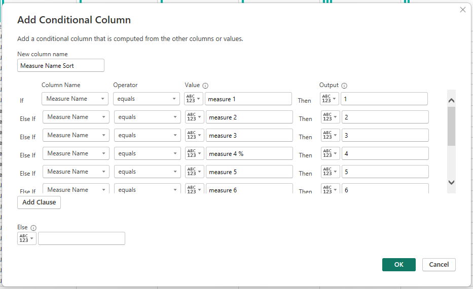
Then, you select “Measure Name” column, go to Column tools, sort by column and choose this new column “Measure Name Sort”.
Result, proper sorting:

We achieved our goal! We display EVERYTHING that was business requirement, but instead of having 30 card visual for one table, we have 3 simple columns.
Perfect!
Summary
Same logic is used for other table visuals on the report page.
In my scenario, all table visual were targeting same Table data, just having different Dynamic measures.
There are additional ways to optimize this process, with some variables, new DAX functions, referencing measures instead of having measure within Dynamic measure..
But the process is the same.
Main goal was to move dozens of measures into rows so that we can easily manipulate with them within dynamic measures.
You can download pbix file here: https://drive.google.com/file/d/1j-KExcFxQAL76ys8h4lGk9WFDbVbz16-/view?usp=sharing
Excel file (data for test): https://docs.google.com/spreadsheets/d/1fpTcYO-4BoI0_PXa3JNVf3iMcQdrsXFn/edit?usp=sharing&ouid=117799558211098864725&rtpof=true&sd=true
