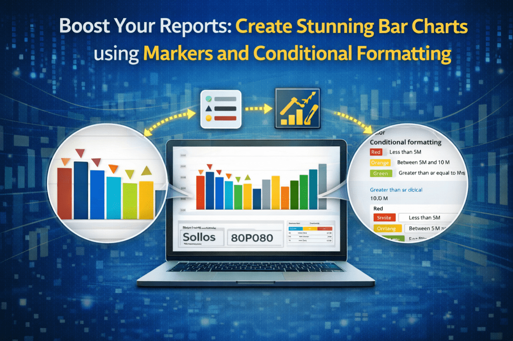
You’ve heard it so many times: “AI will replace us!”
Will it?
AI can already create high-quality reports and visuals.
But if you focus on creativity, you stay ahead.
So… let’s get creative!
In this post, we will compare three different levels of one visual – clustered bar chart.
For this post, you can download pbix file: Link
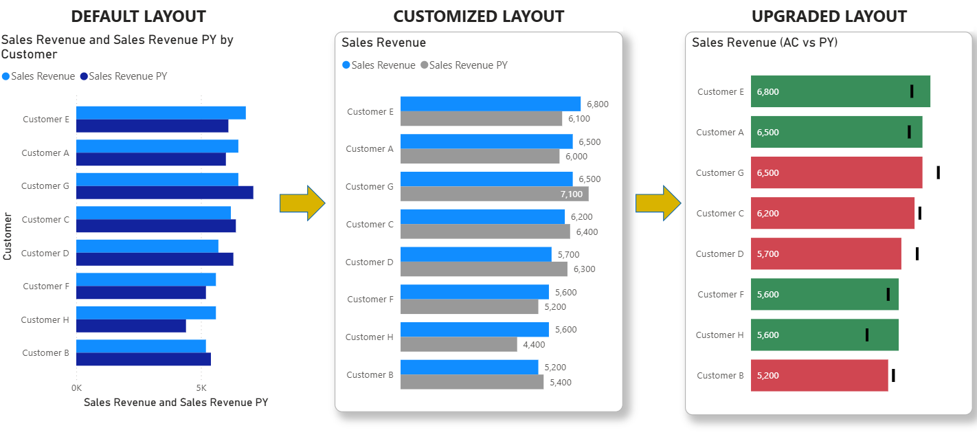
1. DEFAULT LAYOUT
If you make no changes to default layout, your visual will have:
- default visual title
- y axis title
- x axis title and values
- default colors
- no labels

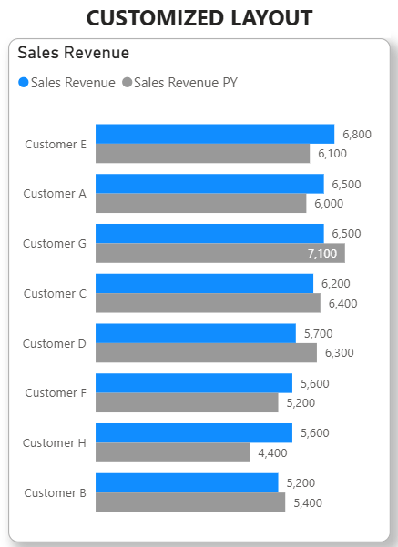
2. CUSTOMIZED LAYOUT
If you spend 10 minutes on this visual, you can make customization, all within Formatting pane of the selected visual:
- visual title – rename
- border and shadow – show
- y axis title – remove
- x axis title and values – remove
- labels – show (in addition, show actual values instead of aggregated value)
- bar colors – as we are comparing to PY it can be grey, to point out this is something that is past. If we are comparing to plan, we will make it in more effective, as it is the goal
After these changes, we get this layout:
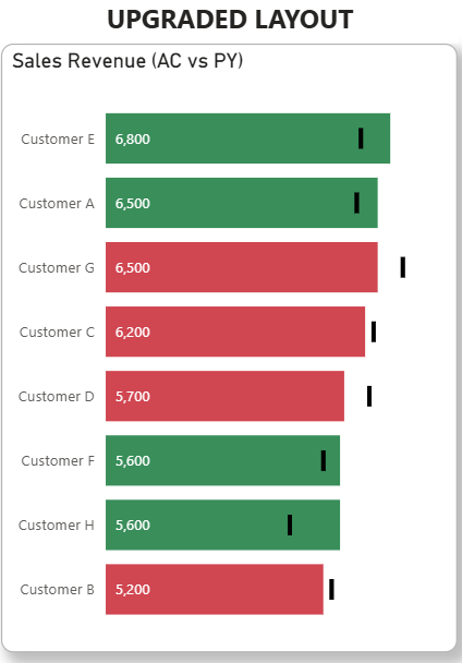
3. UPGRADED LAYOUT
Now, let’s make a difference.
Let’s be more creative!
What can we add additionally?
Let’s see:
- Conditional formatting – mark customers who still generated less revenue comparing to previous year – their bars can be red. For the ones that generated more income than last year – their bars can be green
- layout with markers – instead of having a lot of bars (AC and PY per each customer) we can show only one bar (AC) and to show PY as marker
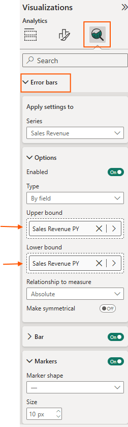
HOW TO ADD MARKER TO BAR CHART VISUAL?
When you select the visual, do not select Formatting pane, but Analytical pane and then go to “Errors bar” option:
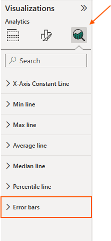
Enable Options.
The main point is to drag your PY metric to Upper bound AND Lower bound.
Under Bar you can actually choose the color of marker.
Under Markers you can choose marker type.
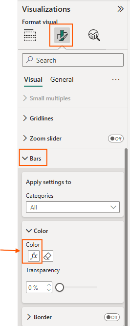
HOW TO ADD CONDITIONAL FORMATTING TO BAR CHART VISUAL?
- Create new metric: Sales Revenue delta = Sales Revenue – Sales Revenue PY
- Select the visual, go to formatting > bars > color. Here click on Fx.
What Fx means?
Colors will not be static, but dynamic, based on the rule you define.
My rule is this:
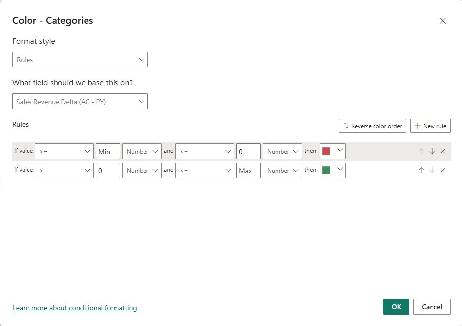
By doing this, i make it easy for end users to see which customer is generating more or less revenue comparing to previous year.
After these upgrades, we get this layout:
So, does it end here?
Of course not!
There are endless of options how we can improve the layout of our report visuals.
A lot of people are talking about SVG, html view, Deneb.. Go and check it out!
Beat AI report developer, be creative!
For this post, you can download pbix file: Link
